Problem
The existing Analytics experience was data-rich but insight-poor.
📈 No centralised view that told a coherent performance story
📈 High cognitive load too many charts, filters, and technical terms competing for attention.
📈 Unclear value for leadership teams struggled to answer basic questions like “Are we improving?” or “Where are the biggest risks?”
Outcome
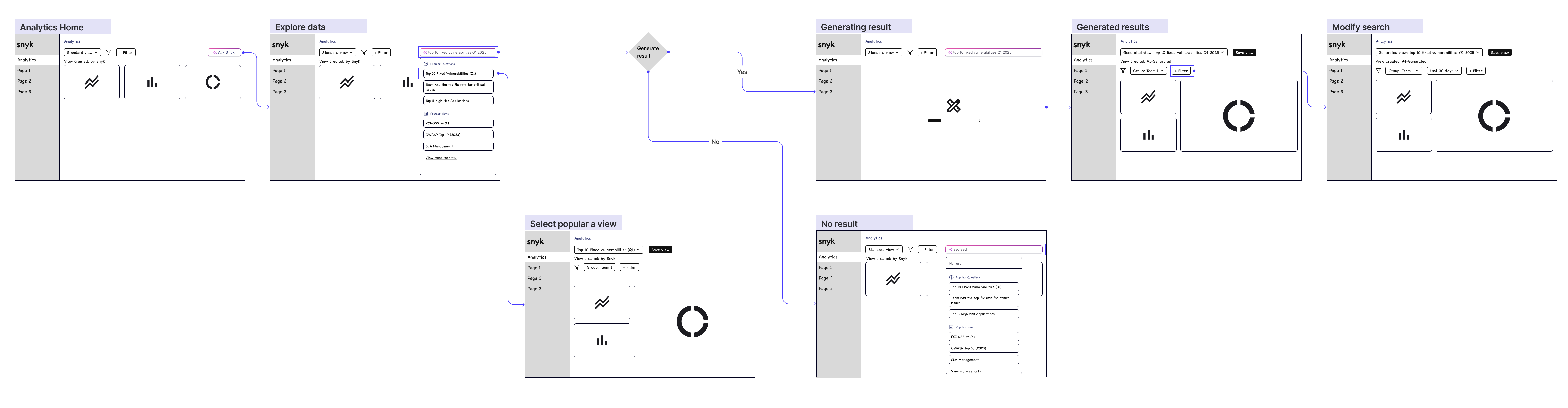
📈 Reframed the Analytics roadmap from “Which charts should we show?” to “What decisions must this data enable?”, changing how leadership and product prioritized what to build
📈 Established a repeatable analytics model now used to structure and evaluate new data modules
📈 Shifted the product toward decision-led insights, rather than raw data or chart volume
My Contribution
I led the research and reframed Analytics around decision-making, not data presentation.
Discovery opportunity
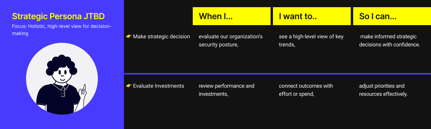
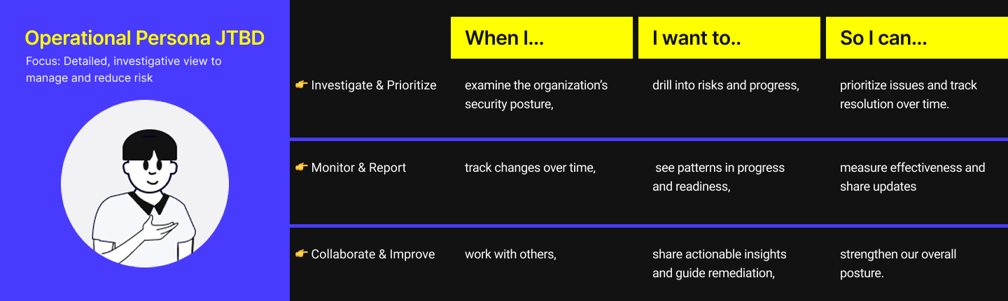
Identify which metrics are most valuable for AppSec users to measure performance, and how they prefer to explore data when answering questions or proving impact.
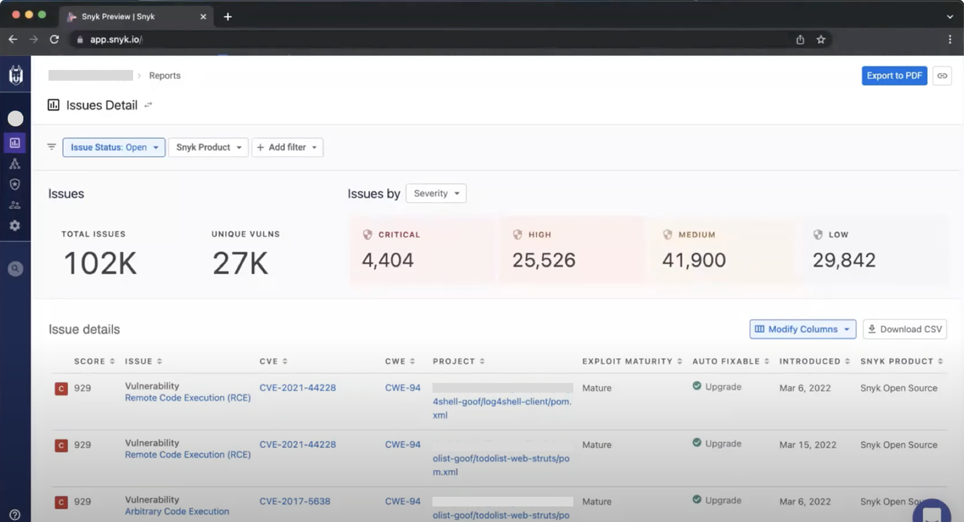
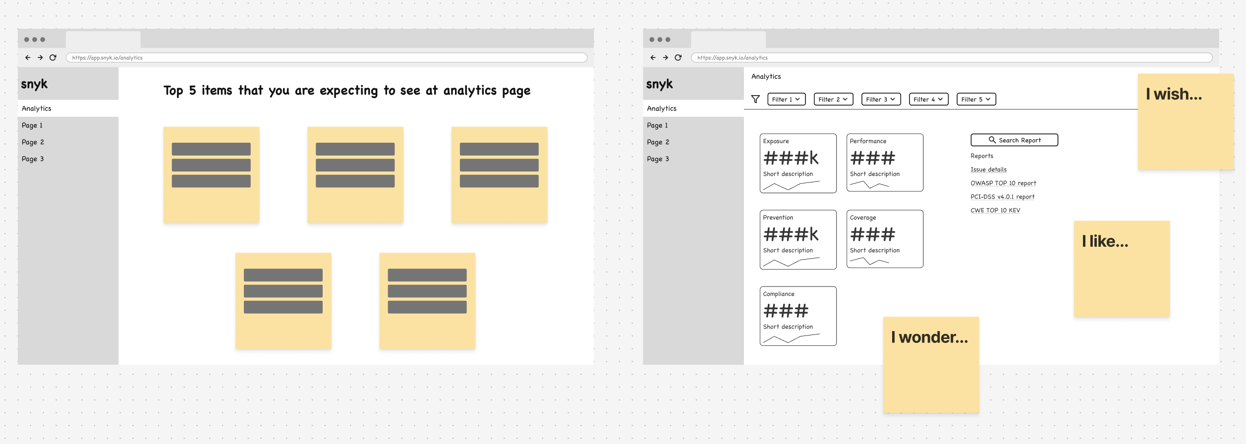
Figure 1: Initial production design