Stakeholder request
“Redesign the homepage to give users faster access to rainfall products.”
I expanded this narrowly scoped ask into a more strategic opportunity:
improving how citizens interpret weather information and make decisions in high-stakes moments.
Problem
Many residents rely on MyObservatory for real-time weather alerts, but critical information (rainfall warnings, lightning alerts, favourite locations) was buried behind menus or masked by low-contrast UI — causing missed warnings and frustration, especially during urgent weather events.
Outcome
The redesign delivered a clean, high-visibility dashboard that surfaces urgent warnings and essential weather data at a glance. The new design system created reusable patterns, reducing future development overhead and enabling quicker rollout of new features.
My Contribution
I led user research, behavioral analysis, and decision-focused design. By uncovering three key behavioral pain points, I refocused the product scope on usability rather than feature proliferation — avoiding expensive but low-value forecasting widgets and instead prioritizing fast access to key info, legibility, and consistency.
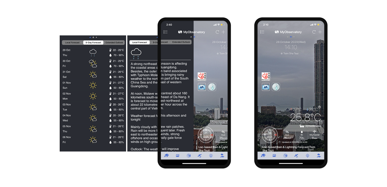
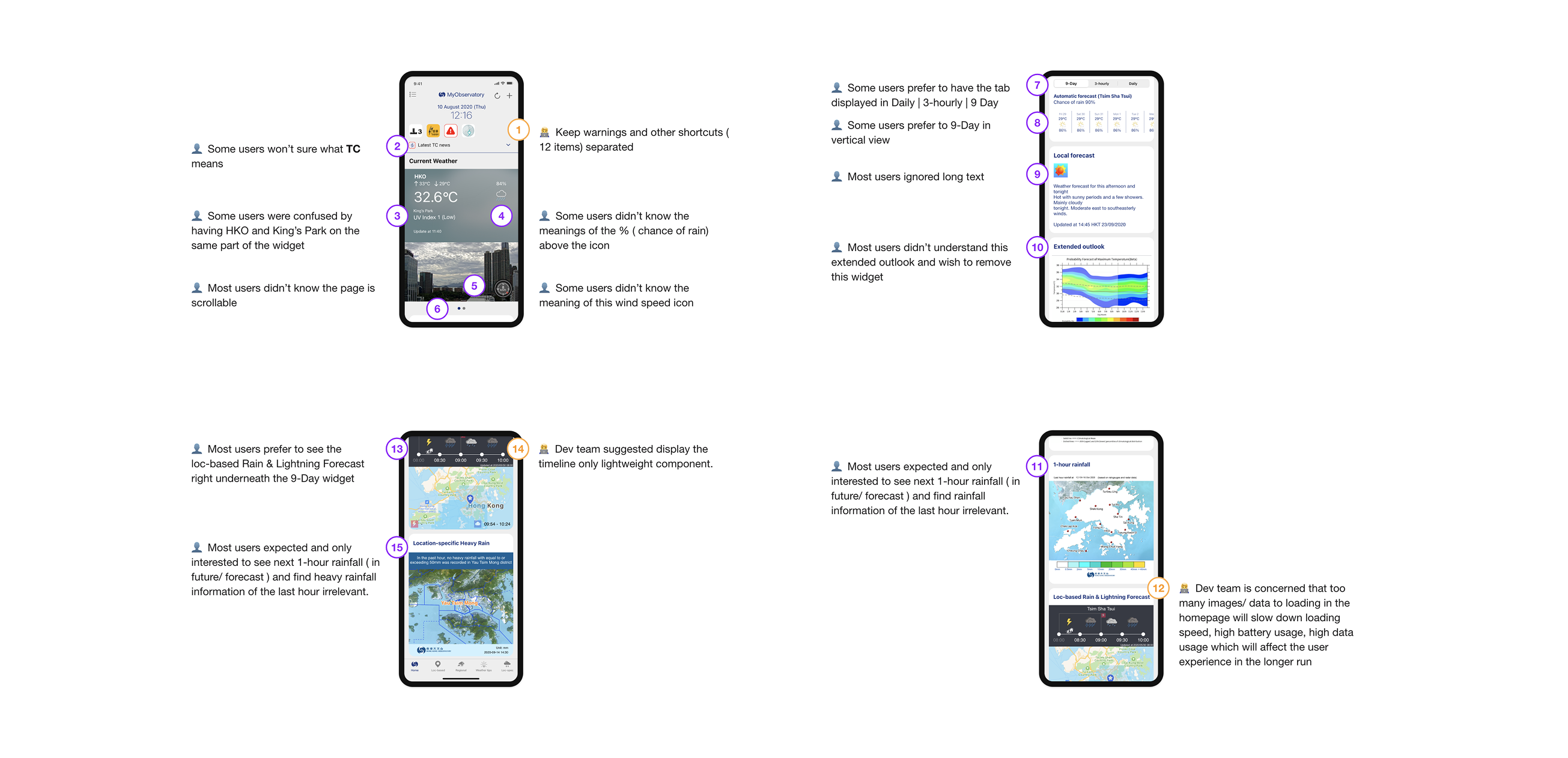
Figure 1: MyObservatory mobile app's original design, hard to scan
Through interviews, usage analysis, and contextual inquiry, I uncovered three behavioral patterns that revealed why users were struggling:
🌤 Buried or disappearing essentials
Critical information (9-Day Forecast, lightning alerts, favourite locations) was hidden or inconsistent, reducing user trust and safety in urgent conditions.
🌤 Feature overload
Many tools were designed for expert meteorologists, not everyday citizens. This created noise and slowed comprehension.
🌤 Low visual legibility
Photo backgrounds and light text weakened contrast, especially in bright outdoor conditions, making critical updates easy to miss.
These patterns prevented the team from investing in complex forecasting widgets that wouldn’t solve the real problem: helping people understand what action they should take next.
From Insights to Jobs-to-Be-Done
The behaviors were translated into JTBD that aligned product, engineering, and meteorology teams:
1. Journey / Daily Planning
When I’m planning my day or deciding whether to travel,
I want to quickly understand what the weather means for my immediate plans,
so I can make informed decisions (go, delay, cancel, prepare) without digging through complex data.
2. Responding to Warnings / Severe Weather
When a weather warning is issued,
I want clear, trustworthy, and easy-to-verify information,
so I can respond confidently and take the right actions to stay safe.